
Ansible Galaxy Redesign
Red Hat & Tufts University
Design Method
1. Identify
In this stage, the research and design team works to characterize users of the product or platform. This is achieved through the use of observations, interviews, online research, reviews, and surveys. After conducting these methods, a set of critical user needs is identified, a list of the most important qualities of the product that users need to have an optimal user experience.
2. Design
In this stage, the team brainstorms different features or modifications for inclusion in the redesign. The team typically creates wireframes, templates, and design concepts utilizing the user needs generated from Identify as a guide. Multiple designs are generated in order to present a range of different choices.
3. Verify & Validate
After multiple design concepts have been created, the team tests the feasibility of these designs with potential users. The team incorporates the feedback gained in this stage to converge onto a single concept and to finalize this design. Finally, the team may implement this verified design.
What is Ansible Galaxy?
As a part of our Senior Capstone at Tufts University, my team worked to redesign the Ansible Galaxy website. This website supplements the Ansible platform, a technology that supports the automation of IT processes. Ansible is an extensive suite of tools that are utilized both through command line and web interfaces. Galaxy is a unified repository of brilliant IT automation solutions created for the Ansible platform that people worldwide have shared. In addition, anyone can download roles that other users have contributed. Our team's ongoing mission is to enhance this service even further by applying user-centered design principles to bring an unparalleled experience to its users.

Project Expectations & Goals
Under the mission of Ansible Galaxy, our team detailed the following goals. The project's main objective is to redesign the Ansible Galaxy website (galaxy.ansible.com) for an improved user experience. The team will conduct user research to define user needs and design the best user interface based on these needs. Modules from the PatternFly Design Library will be used wherever applicable. Furthermore, our newly designed patterns will contribute to PatternFly. We have also taken on the stretch goal of fully implementing the newly designed website.
Exploratory Interviews
The first step of characterizing Ansible Galaxy users was meeting with Red Hat sponsors to understand the project expectations and goals better. Before this project, the team members were unfamiliar with the IT domain, so this video conference allowed them to understand the product better. The team learned about Galaxy's role within the IT community and possible interactions users could have while using the website. The team set up a weekly meeting time to maintain consistent contact with Red Hat sponsors.

Online Literature Review
The team performed an online literature review to supplement the information learned in the exploratory interview with Red Hat. This review filled in critical knowledge gaps in terms of IT automation and the Ansible Galaxy product domain. The team reviewed various sources, covering topics from current impressions of Ansible Galaxy to typical IT tasks. Finally, team members reviewed and summarized each article with final bulleted lists. This literature review provided the team with a foundation moving forward into a heuristic analysis of Galaxy and its competitors.

Heuristic Review
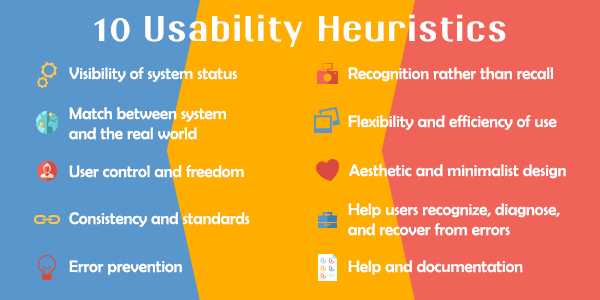
The next task involved conducting a heuristic analysis of Ansible Galaxy, Docker Hub, and the newly-created Docker Store Beta. A heuristic analysis is a method of comparing products to a set of predefined characteristics. The team used Nielsen's 10 Heuristics for Good User Interface Design (Nielsen, 1995). This set defines ten separate metrics, such as error recovery and overall aesthetic quality. This heuristic review provided a qualitative assessment of each of the three evaluated platforms, which served as a crucial stepping stone in extrapolating a quantitative analysis in our expert review. In addition, this heuristic review served as an effective and succinct platform from which we could begin to identify possible missed use-cases. The review ultimately helped to inform our creation of user needs by informing the development of survey items.
Expert Review
After completing our heuristic review, we conducted an expert review of Ansible Galaxy, Docker Hub, and the Docker Store Beta site to quantitatively measure the current sharing platforms. Each team member ranked each platform on a scale of 0-5 for various metrics defined by the team (i.e., Ease of browsing). This ranking provided a more quantitative set of metrics for comparing the overall quality of each site's user experience and an item-by-item comparison of which sites have better flows for specific tasks. Like the heuristic review, the expert review helped the team concentrate the survey questionnaire items to uncover user needs from areas where Ansible Galaxy could be improved.
Survey Creation & Modification
Following the expert review and exploratory interview, the team began to characterize the users of Ansible Galaxy more precisely. To do so, we utilized our preliminary findings to develop a structured survey for current and potential users about their needs. The team piloted the survey to Red Hat sponsors, Dr. Aurelio (professor of Capstone course), and a current Tufts Technology Services (TTS) employee. The team modified the survey according to the feedback received, ensuring that the survey would generate applicable and relevant information. The team distributed the survey to locally accessible system administrators, the Ansible Galaxy User community members through Red Hat sponsors, and IT professionals on a Reddit Ansible community forum. The team had initially proposed to reach out to Ansible Galaxy users via their GitHub repositories; however, this process would have been less efficient than the one conducted.
Survey Results
The team used Google Forms' built-in functionality for analyzing survey responses and codified open-ended questions based on commonly mentioned ideas. This analysis helped us determine what users found to be the most salient issues or essential features of IT automation sharing platforms. Averages were generated for specific questions, providing quantitative results. The qualitative questionnaire results were coded by identifying themes and tallying up responses that fell into each category. In total, 18 responses were considered in our results analysis. Based on what users consistently stated were essential features for these platforms, we developed a specific and refined list of user needs.
User Needs Development
Based on the survey results, Andromeda was able to paint a detailed portrait of a typical Ansible Galaxy user. Additionally, the team identified good and bad elements of current automation platforms. For example, good IT automation platforms such as Ansible Galaxy need to host reliable content, support easy interaction, and offer a variety of choices. Conversely, less good platforms lack curated lists, provide poorly coded modules, and ineffective or incomplete documentation. The methods conducted by the Andromeda team resulted in the development of a set of ten user needs that ultimately factored into initial concept generation.

Translating User Needs into System Requirements
With user needs and their detailed justifications from the research findings established, the team then proceeded to map out how these needs and justifications translated to system requirements. The team compiled a table that tied each piece of feedback to a user need. The wording of each user need was then adjusted to reflect a more concrete requirement of the system. For each created system requirement, the team assigned a priority ranging from Priority 1 to Priority 3 (P1-P3). These scores served as a reference to keep the team on track by first focusing on the most critical system features.

Developing Our Design Process
With a better understanding of Ansible Galaxy and its users, the team developed a multi-stage design process that prioritized user-centric design decisions. This process contained three stages. In the first stage, the team would create a set of features for inclusion in the redesign. For each of these features, the team would design three different concepts. After usability testing, the team would eliminate one of these three concepts. In the second stage, the two remaining concepts would be divided among two low-fidelity prototypes. Another round of usability testing would reveal the single winning concept per feature. Finally, stage three would involve aesthetic concept testing and refinement.
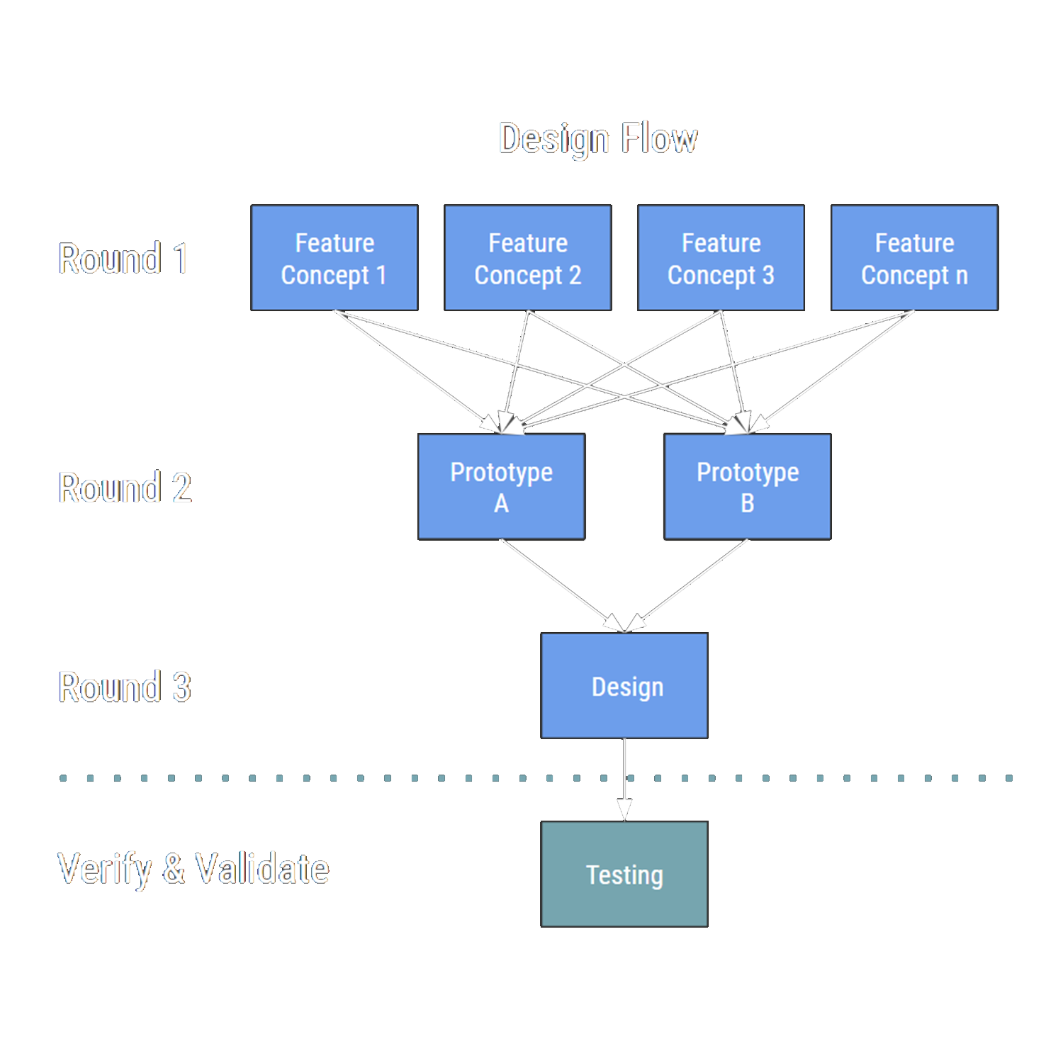
Design Brainstorming
Andromeda began designing a solution that fulfills these needs and requirements from a purely creative perspective first. To start, the team performed a brainstorming exercise in which each member wrote singular features or concepts on Post-Its for consideration and inclusion in the new designs. The team had three minutes to write as many features as possible. In this stage, no ideas were discouraged; the purpose was to generate as many ideas as possible. Following this exercise, the team grouped the Post-Its under high-level categories and rated them for the importance of inclusion in the redesign.
Feature Development
The team outlined design features across the high-level categories created during brainstorming. The purpose of this exercise was to brainstorm differences in features for presentation to users. The group met to determine which features would be included in the first round of concept development. Some of the features that we came up with through our brainstorming activity relied too heavily on aesthetic design. For this reason, the team decided to hold off on developing these concepts until the next round, where styling would be a principal focus.
Concept Generation
After identifying key features, the team developed three different concepts (referred to below as 'options') for each feature. These concepts were created using a wireframing tool called Balsamiq, which allowed each team member to produce concepts at the same level of fidelity. Wireframing, rather than creating high fidelity mockups, ensured that the aesthetic design across concepts within a given feature would not confound our feedback.
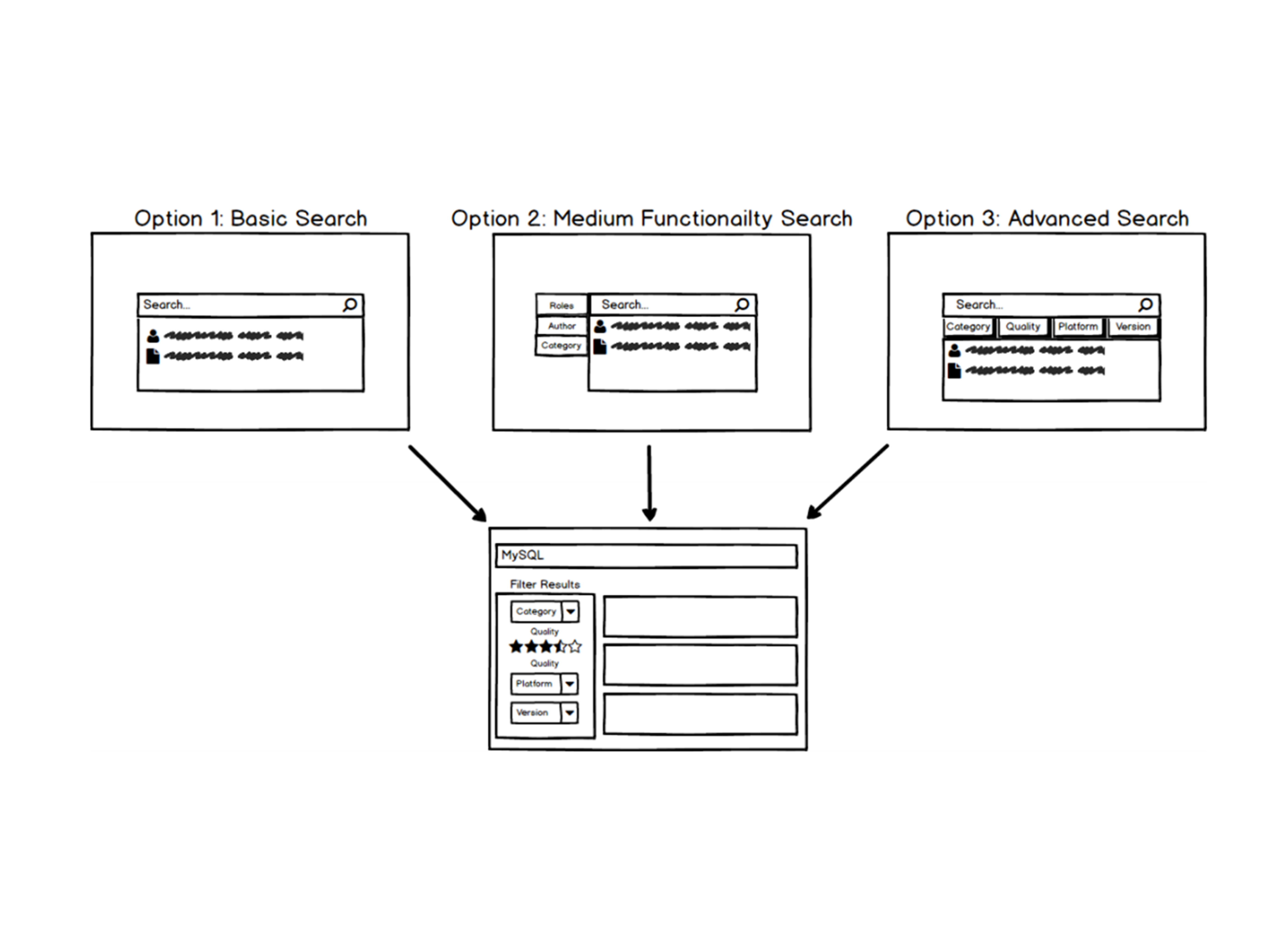
Usability Testing Round 1: Feature Sets
In this first round of usability testing, the team introduced participants to the feature sets they designed to hone in on the best concepts in each feature set. With a low fidelity series of screens meant primarily to convey different fundamental solutions to the high priority functionalities of Ansible Galaxy, we felt that a Demonstration-Reaction approach would best suit our research needs. Rather than skipping straight to a more detailed mockup with a more rigorous form of design feedback to go along with it, Andromeda saw clear benefits to talking through our concepts with a small sample of experts and users first. By having these unstructured discussions, the team's goal was to verify the strengths and weaknesses of the concepts and gather outside perspectives on possible alternative solutions for each feature. More concretely, the purpose of these interviews was to determine the best two concepts for each feature.
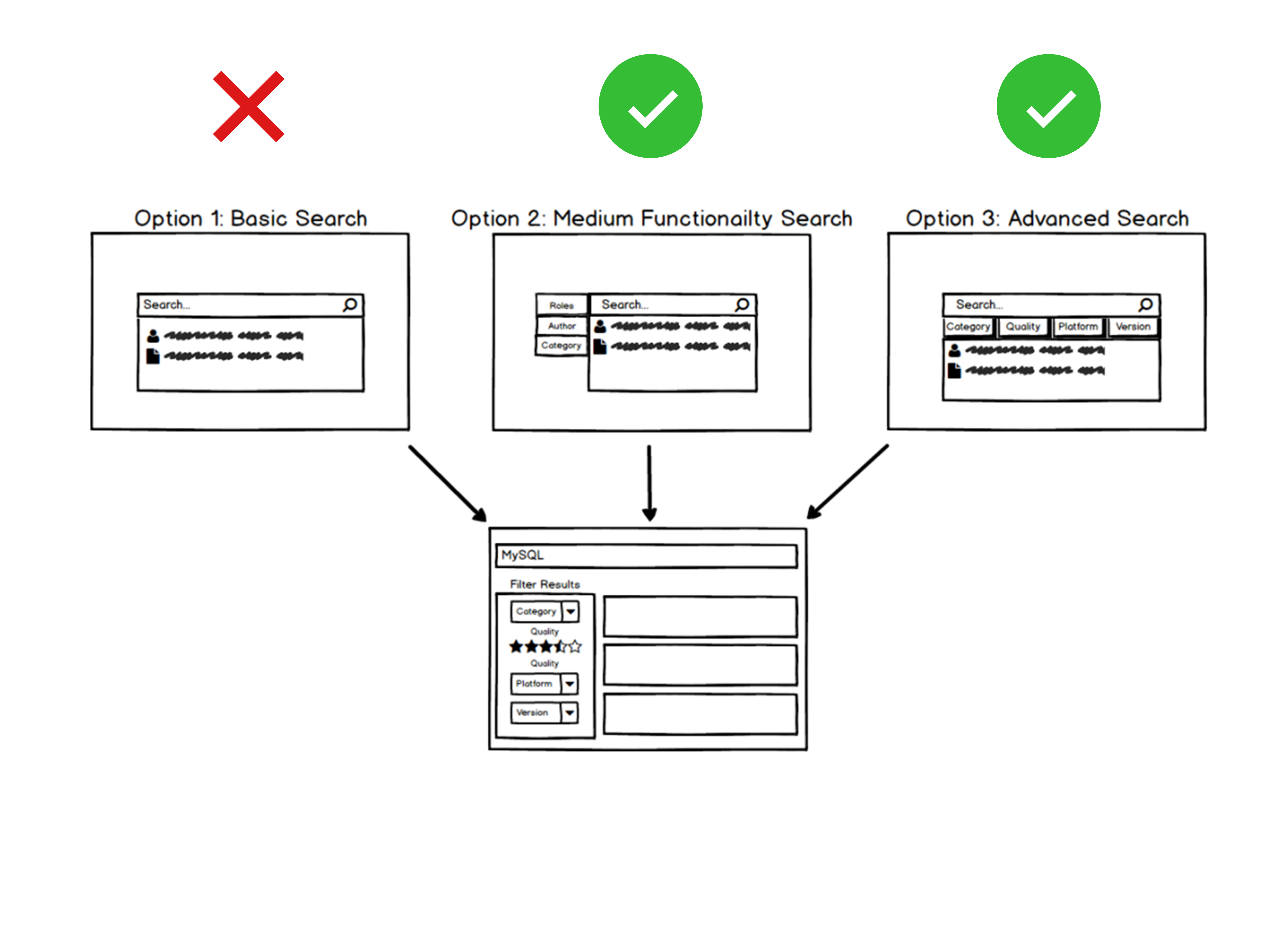
Usability Testing Round 1: Results & Conclusions
The team codified the results of the demonstration and reaction sessions. Participants' rank-ordered preferences of concepts for each feature were recorded in a spreadsheet to determine which concepts would not move on to the next design round. The team removed the concept with the worst ranking (highlighted in red in the image to the right) from further consideration after reviewing and considering the qualitative comments. As the team prepared to move to a higher level of fidelity, our next step was to design two alternative, interactive mockups of Ansible Galaxy as a whole. Naturally, these mockups would mostly comprise the components developed and tested up to this point as individual features. While each alternative prototype broadly employed one of the two preferred solutions for each feature, Andromeda also took the qualitative suggestions and ideas gathered in this round of feedback into account during the next design stage.
Usability Testing Round 2: Low Fidelity Mockups
Following the insights generated from the first round of usability testing, the best two concepts were identified for each feature set, and in some cases, adjustments were made in response to user feedback. These concepts were then arranged and aggregated into two full website concepts, A and B, and made into two separate prototypes using Invision. The goal for this round of usability testing was to arrive at a single preferred concept for each feature set and thus gather the feedback necessary to begin constructing a final, high-fidelity website design. The team utilized the feedback from this round to determine whether the final concept for each feature would be one of our two alternate concepts, some combination of them, or a new concept entirely.
Usability Testing Round 2: Results & Conclusions
The team codified the results of the second design round in two ways. First, participants' rank order preferences of concepts for each feature were recorded in a spreadsheet. We used these rankings in combination with rankings from the first round of demonstration and reaction sessions to determine which concepts would not move on to the next design round. The results from the first round were comparable in most cases because participants had been shown the same two concepts as in Round 2, in addition to a third which has already been eliminated. We adjusted Round 1 rankings to be compatible (first choice, not first choice) with Round 2 rankings and used them to supplement the six data points we gathered in Round 2. Finally, because we had limited feedback from true Galaxy users, we weighted the three data points from these users to make our decisions as user-centered as possible. This informed our weighted vote totals. We doubled votes by Galaxy users (highlighted in purple below) to create these weighted totals. For each feature (except for the bookmarks feature), the concept with the highest weighted ranking will be used in our final aesthetic concepts.
Usability Testing Round 3: Informal Expert Review
The goal of this research stage was to create a single, high-fidelity design solution and share it with our Red Hat, Inc. UX sponsors to receive iterative feedback. Following the second round of demonstration and reaction sessions, the team narrowed down all features to the winning concept. Next, the team began to weave these concepts into one fully-developed, aesthetic concept using Adobe Illustrator. Once the first iteration of each website screen was designed, the team conducted a screen share conference with UX professionals from Red Hat, Inc. This session was conducted to gather UX and design feedback strictly on the high-fidelity screens.
Usability Testing Round 3: Results & Conclusions
Following the collection and consideration of the comments and suggestions received from this session, the team refined the screen designs and any relevant design elements. Next, the team grouped feedback and comments by each website screen. While not explicitly suggested, this round of feedback also inspired more profound thought in several critical areas of the website, which prompted other changes. Following these modifications to the high fidelity mockup, the ultimate result of this round of usability feedback was the creation of the Design Specification. This document detailed all of Andromeda Design's final design decisions and documented styles and interactions. Furthermore, the team produced a final set of high-fidelity website screens.
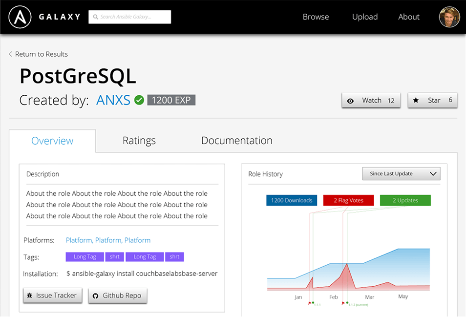
System Requirement Verification
Following the finalization of the screens and the Design Specification, the team verified that the final design addressed each of our system requirements in full or otherwise explained our rationale for deviating from the original requirement. Below we have mapped each system requirement to our design solution, thus demonstrating the successful conclusion of the Human Factors iterative design method. With the successful mapping of each system requirement to its respective design solution, the team proved that the final design was inspired by and grounded in user-centric design decisions.
Final Screens
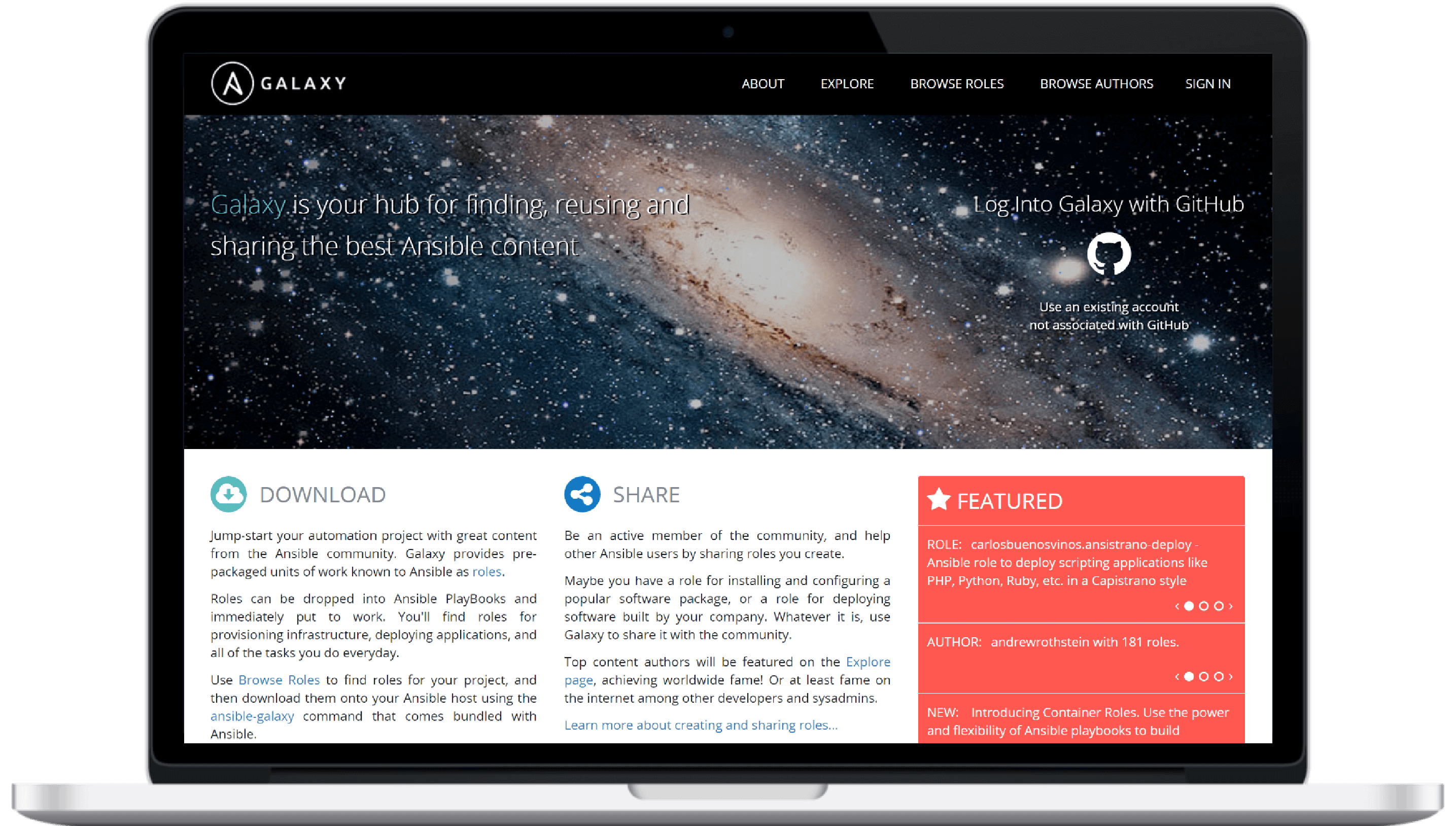
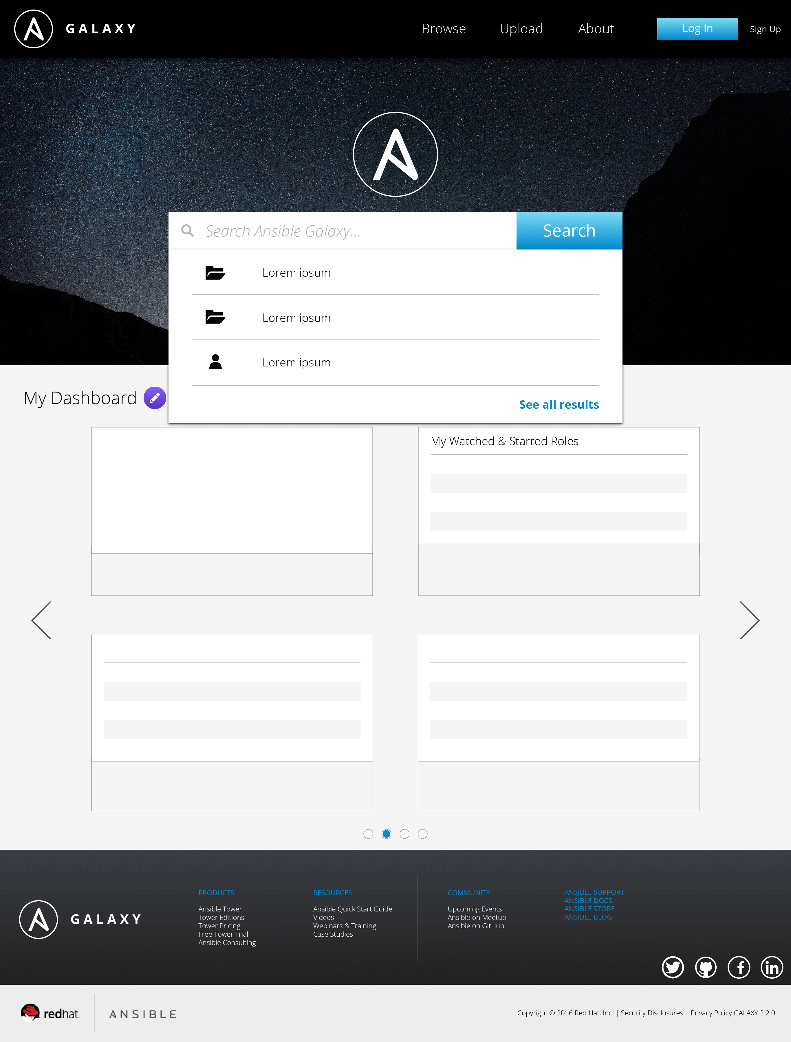
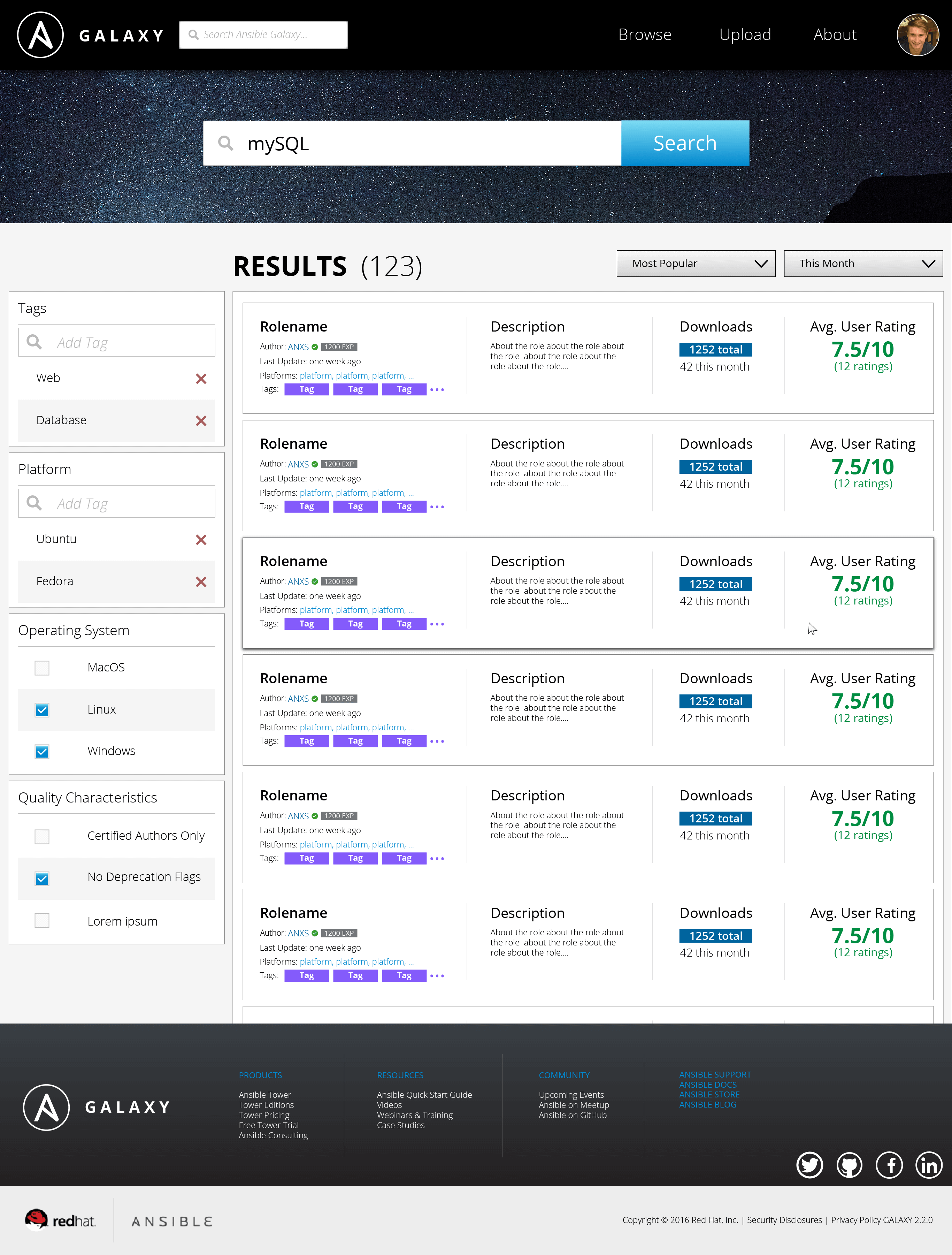
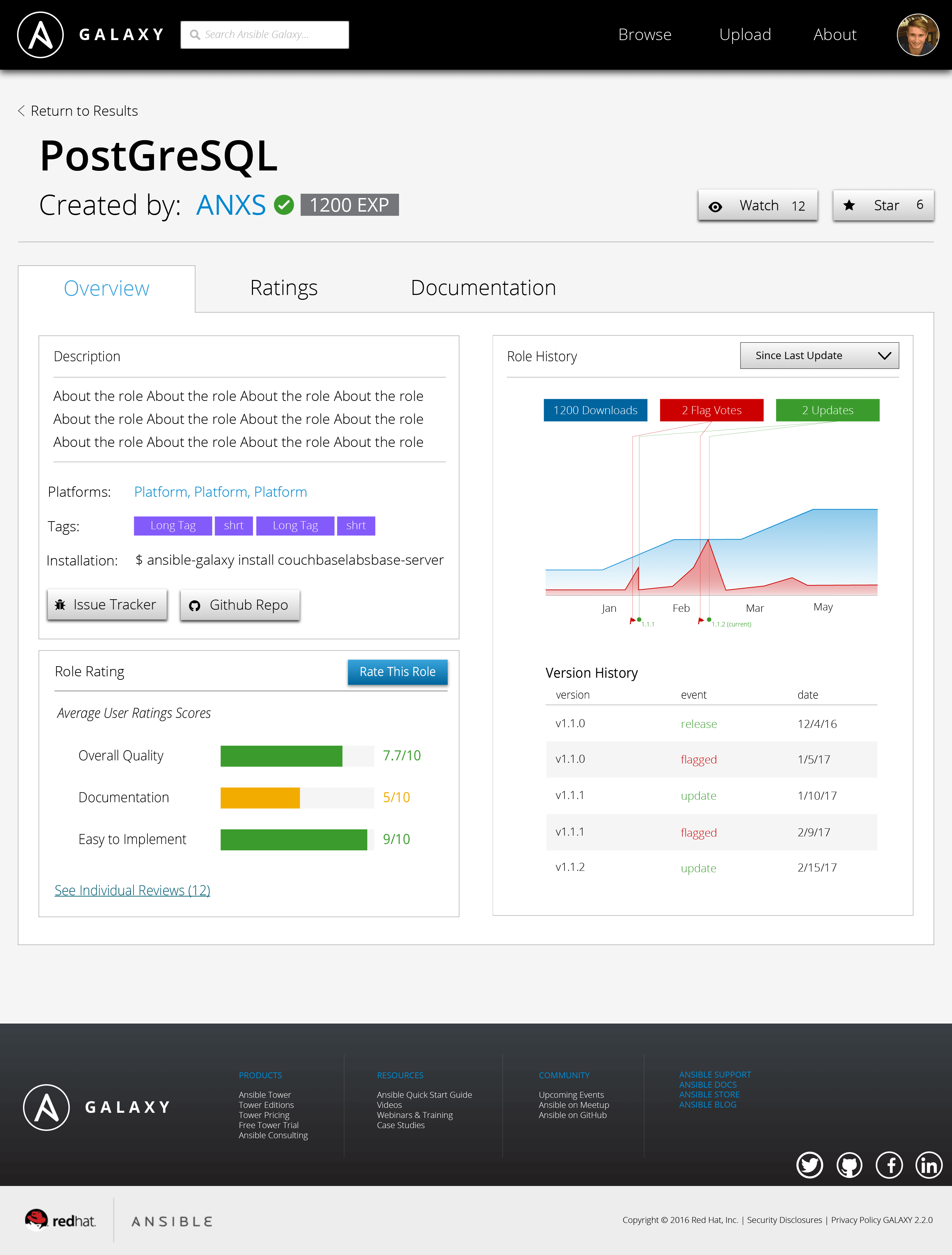
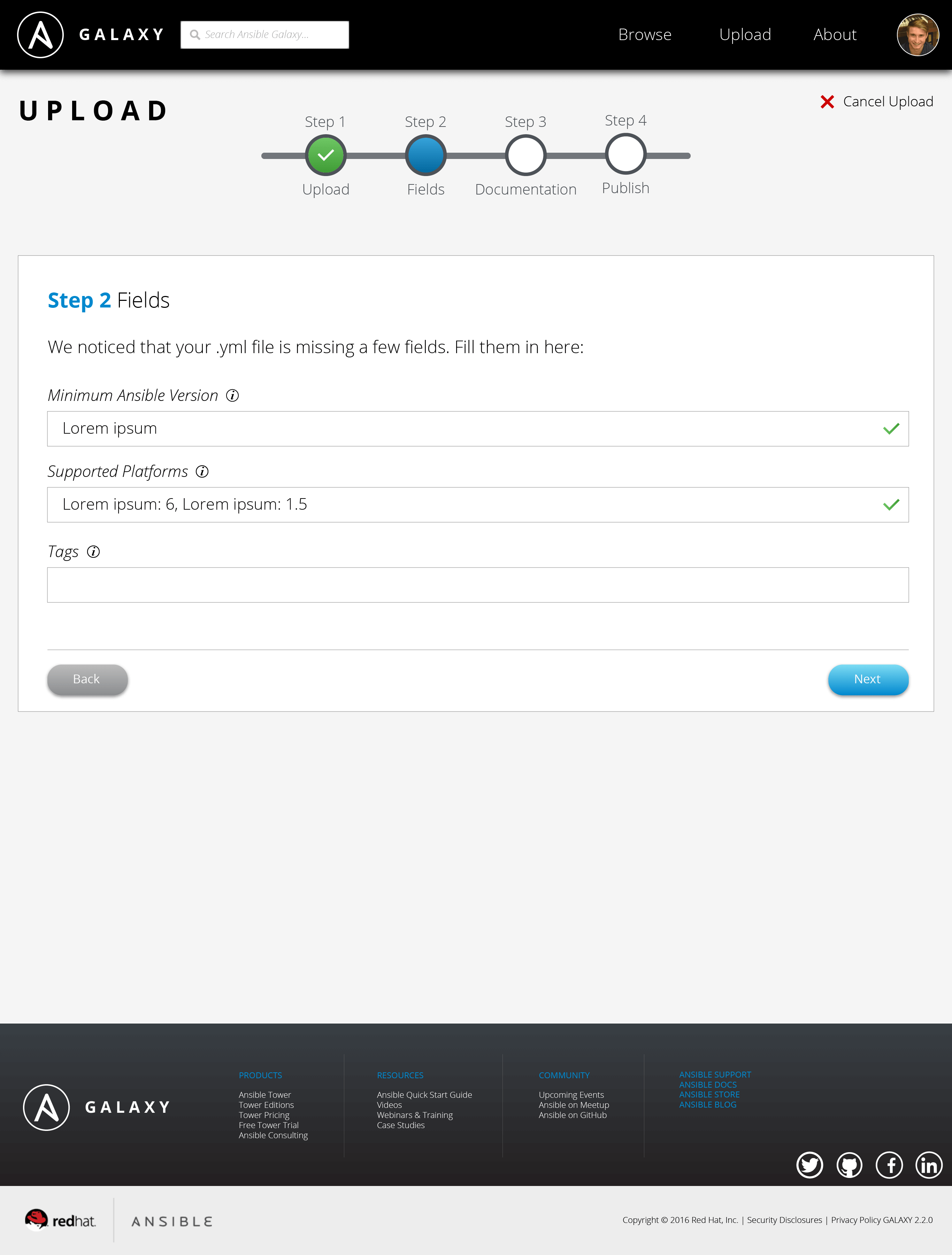
Featured below are some of the most important screens of the Ansible Galaxy site. The current, live version of the website is shown on the left, and our proposed redesign is shown on the right. Working with the Red Hat UX team has been a phenomenal experience. My team and I received incredible support, and we are proud to deliver our designs to Red Hat. Special thanks to Red Hat sponsors/supervisors Colleen Hart and Serena Doyle, capstone professor David Aurelio, and my incredible team - Laura Brooks, Alexander Golin, and Alejandro Osio - for making this project successful.
Login Screen
Original
Redesigned

Home Page
Original
Redesigned
Search Results Page
Original
Redesigned
Role Page
Original
Redesigned
Upload
Original
Redesigned
User Profile
Original
Redesigned
@2x.png.png)